


After 14 years, LABA: A Laboratory for Jewish Culture has embarked on a dynamic visual transformation. A new visual identity, the product of a process that isn’t just about a new look, but a reflection of the profound growth and expanding vision of the 14 year-old program.
From one New York City location, we have grown into a thriving international program that brings together artists and scholars from five different hubs around the world. We sensed it was time to create a new design for our LABA brand, one that would represent our evolution as we became an increasingly global initiative.
And so, we embarked upon a search for a symbol that could encapsulate LABA’s vibrant intersection of ancient Hebrew texts, which fuel LABA’s contemporary artistic journey and modern artistic expression, immersed in a pool of ideas, images, and archetypes, LABA transcends theological constraints, allowing friction between tradition and our generation’s sensibilities to trigger growth.
In our exploration of the LABA brand identity, we turned to designer Avi Bohbot. He had already worked with LABA Berlin to establish their sharp visual presence, and we trusted him to be the right partner to reimagine our global brand as well. True to LABA’s collaborative spirit, the logo redesign became a global effort. Avi engaged in dialogue with international LABA staff and artists, ensuring that the new look would resonate with our community worldwide.


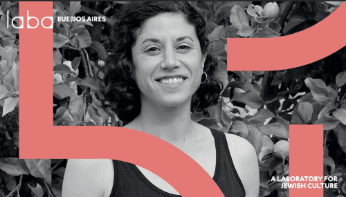
Together, we landed on a new logo centered around the Hebrew letter “Lamed,” which is considered the heart of the Hebrew alphabet. In both Hebrew and English, LABA (or לאבה) begins with “Lamed”’s L sound. Fittingly, the Hebrew origins of the word “Lamed” mean to prick, incite, or goad – all actions that feel very true to LABA’s goals.
As we continue to reach for new artistic and intellectual heights—prodding, questioning, and inciting debate along the way—we can now draw upon our LABA logo for added inspiration.
The redesigned logo breathes new life into LABA’s identity, while drawing from the timeless beauty of ancient Hebrew calligraphy. This fusion of classical script and modern design elements has created a unique visual language.

Next, we considered how the new brand identity could inform our LABA website. In addition to incorporating our “Lamed” logo into various design elements throughout the site, we decided to change the actual web address. By transforming the URL from LABAJournal.com to LABALAB.ORG, we are signaling a major identify shift. No longer a traditional online journal, we are now an interactive laboratory. The transition from “.com” to “.org” also emphasizes our commitment to becoming a global nonprofit organization—a community with a shared mission.
We also encourage you to explore our website’s new mosaic-style pages. Featuring assorted visual elements from various LABA hubs, this new layout celebrates the international nature of LABA while acknowledging the distinctiveness of each local community.
We hope that you’ll be inspired to join us on LABA’s artistic journey as we continue to paint new designs on the ever-evolving canvas of Jewish culture.